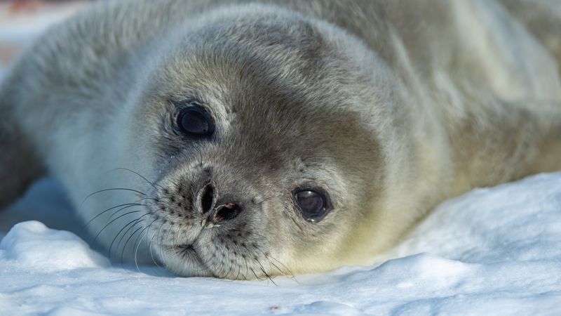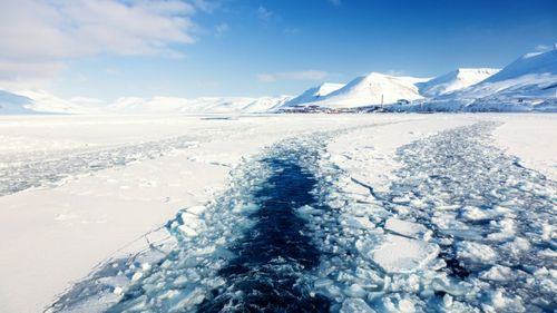
No matter which measure you use, it’s clear that the Arctic is in serious trouble. If the Paris climate change agreement isn’t adhered to, our northern icy realm could warm by up to 20°C (68°F) by the 22nd century, which would effectively obliterate its ice cover. Disconcertingly, even if the 2°C (3.6°F) warming limit is stuck to, the immediate future for the Arctic looks fairly grim: the maximum winter sea ice extent has bottomed out recently, and the snow there is beginning to melt at its earliest ever date.
As a series of up-to-date infographics from Andrew Slater – a researcher at the National Snow and Ice Data Center (NSDIC) – show, man-made climate change is helping to break record after record in the region. Perhaps the most striking graph is one that shows how many anomalously warm days and cold days there have been in the Arctic over the last year.

A depiction of the high and low temperature anomalous days over time, compared to the 1980 - 2010 median.
The central horizontal line shows the average Arctic temperature between 1980 and 2010, and the red line shows how far 2015-2016 has deviated from this average. The amount of anomalously warm days is literally off the charts, clearly showing that the Arctic warming is accelerating at an unprecedented pace.

Comparing temperature readings over time to the 1980-2010 median.
A second graph shows how far above the expected temperatures the Arctic is currently experiencing. With the way things are going, it’s likely to be above the freezing point of water by the time July arrives.

Sea ice extent projections, estimates, and measurements compared. The infographic to the right shows sea ice projections for this July, based on current data.
Another pair of graphs depicts the actual and projected sea ice extent in the Arctic. As they clearly show, the calculated projections for this year’s spring sea ice extent have been already far below the 1979 to 2015 average; worse still, the actual measured sea ice extent this spring has been even lower than these already pessimistic estimates.

Sea ice extent over time.
Another recent infographic depicts Arctic sea ice extent from 1979 to the present, and it’s clear that only the ice at the most northerly latitudes that has not succumbed to increasing atmospheric and sea surface temperatures. Over the last few decades, the more southerly chunks of sea ice have all but disappeared, and it looks almost certain that within the near future, even the coldest ice will begin to thaw out.
Maximum Arctic sea ice extent for March from 1979 to 2014. Matt Savoie, National Snow and Ice Data Center, University of Colorado, Boulder/NSIDCorg via YouTube
The less ice cover there is up there, the less reflective it will be. Water is great at retaining the solar radiation it slowly absorbs for considerably long periods of time, and the more of it there is in the melting Arctic, the warmer it gets, and the more ice melts into water. This dangerous cycle looks set to continue into a future where an icy Arctic becomes less a reality and more of a distant memory.
[H/T: Gizmodo]
All graphs by NSDIC.